Boutique Real Estate Website Demo
Crescent Harbor Realty
A boutique coastal real estate concept built for buyers, sellers, and investors who expect clear guidance, elevated presentation, and local market strategy. Crescent Harbor Realty is an industry demo built to show what a modern real estate web experience can look like when design, motion, and editorial structure work together.
Category
Boutique Real Estate Website
Market Focus
Waterfront Homes
Coastal Estates
Marina Properties
Private Representation
Deliverables
- — Editorial split-screen hero
- — GSAP scroll animation system
- — Featured property horizontal scroll
- — Neighborhood editorial grid
- — Sell & Buy tab advisory section
- — Our Method trust section
- — Contact / consultation flow
- — Brand token design system
- — Mobile-first responsive layout
Overview
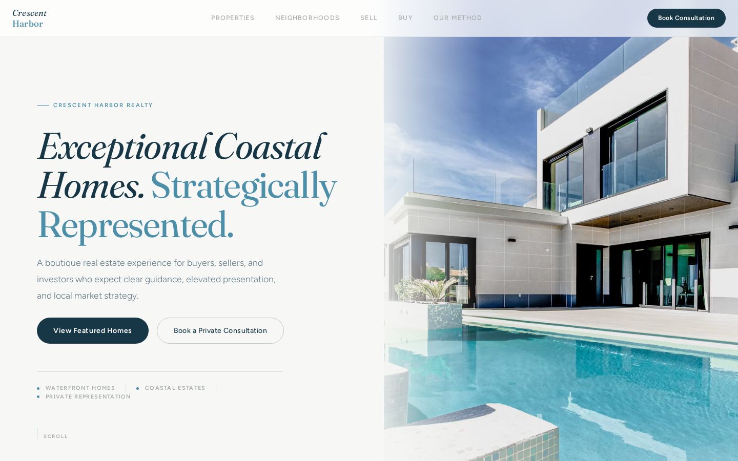
Crescent Harbor Realty is a boutique coastal real estate concept built for buyers, sellers, and investors who expect clear guidance, elevated property presentation, and a local market strategy that works in their favor. The project called for a single-page experience with genuine scroll motion, editorial section design, and a visual system that earns trust before any conversation begins.
The Problem
Most coastal real estate websites feel like repainted MLS portals — property cards with no hierarchy, no motion, no editorial presence, and no clear sense of who the agency is or what makes them worth a conversation. Buyers and sellers increasingly judge representation by the quality of the digital experience before the first showing. Generic templates fail that test before the page even loads.
The Direction
New Level Design Studio built a single-page real estate experience centered on editorial quality and GSAP-powered scroll motion. Each section has a distinct design language: a split-screen hero with entrance animations, a horizontally pinned featured property strip, a 12-column neighborhood editorial grid, a tabbed sell/buy advisory layout with sticky lifestyle photography, and a five-step consultation methodology section. The result feels like a brand publication, not a listing site.
Design Direction
The visual system uses a coastal-specific token palette — porcelain backgrounds, atlantic blue accents, deep-tide headlines, and sea-glass section breaks. Typography pairs Fraunces variable serif for editorial presence with Figtree sans-serif for clarity and warmth.
- — Porcelain / sea-glass / atlantic blue coastal palette — brand-specific CSS tokens
- — Fraunces variable serif — editorial headlines with italic range
- — Figtree sans-serif — warm, readable body and UI type
- — Split-screen hero: 52% editorial copy, 48% architectural photography
- — Dark gradient scrims on all full-bleed photo panels for legibility
- — Per-property accent palette for Featured card identity
- — Featured card horizontal pin scroll with GSAP ScrollTrigger
- — Neighborhood 12-column editorial grid with featured card spanning 2 rows
Key Features
- — GSAP entrance animations: eyebrow → headline → body → CTA stagger on load
- — GSAP parallax: left content scrolls -40px, hero image scales 1.05× on scroll
- — Horizontal pin scroll for five featured property cards
- — Neighborhood editorial grid: CSS Grid 12-column, first card spans 6col×2row
- — Sell/Buy ARIA tablist with per-tab GSAP re-entrance animation
- — Sticky lifestyle photo panel with scrim and label overlay
- — Our Method section: five-step numbered process with scroll stagger
- — Trust section: agent profile cards and client testimonials
- — Contact section with consultation form and 555 fictional phone
- — Footer with strong demo disclaimer and NLDS attribution
- — noindex/nofollow meta + robots.txt — not indexed by search engines
- — React + Vite + TypeScript — clean modern build
Outcome
The final demo gives New Level Design Studio a real estate portfolio example that demonstrates how GSAP motion, editorial section design, and coastal brand identity can combine into a single-page experience that feels premium without being overwrought. It shows local real estate professionals what a web presence built for trust, clarity, and conversion actually looks like in practice.
Why This Matters
In coastal real estate, first impressions happen online — not at the showing. A website that reads like a template suggests the representation will feel like a template. By combining genuine scroll motion, editorial structure, and a market-specific visual identity, Crescent Harbor demonstrates how a boutique agency can present itself at the same caliber as the properties it represents — before a single conversation happens.
Ready to Raise Your Standard?
Let's build a website, visual system, and content strategy that makes your business look as good as it actually is.
Start a Project